How to design custom bread bags like the big brands
By Hamza Benhlima · 30. June 2023
Just like the big brands, you can create custom paper bread bags that leave a lasting impression on everyone who sees them.
It’s important to have a design that reflects your brand’s identity and, most importantly, sets you apart from the competition.
Let’s cover some of the key elements needed to create an impactful bread bag design and look at some great examples of bread bag designs from brands we’ve worked with.
Why is having a good bread bag design important?
Having a good design on your bread bags is important for many reasons, one of them being that it can help you build brand recognition as well as loyalty among customers.
A well-designed bread bag will make your products stand out💫 and differentiate you from competitors, and in the end, this will help attract customers.
With a design on your bread bags, you can communicate relevant information about your brand identity and show exactly what it’s all about.
An eye-catching design on your bread bags will make people remember you and recognize your brand the next time they see it.
What makes a good bread bag design?
There is no ‘perfect’ bread bag design, but there are many key elements that can make a design effective.
One of the most important is the presence of a clear and easily recognizable logo, which creates brand identity and makes it memorable.
Additionally, including elements such as motifs, patterns and slogans can help capture the essence of a brand and make it easier for customers to identify it in the crowd.
However, a bread bag design doesn’t need many elements to be effective. Just having a logo alone is enough to establish brand recognition and make a lasting impression on customers.
Let’s take a look at some great bread bag designs from brands we’ve worked with to see how they’ve used different design elements to create unique and eye-catching bread bags.
L’Épicerie
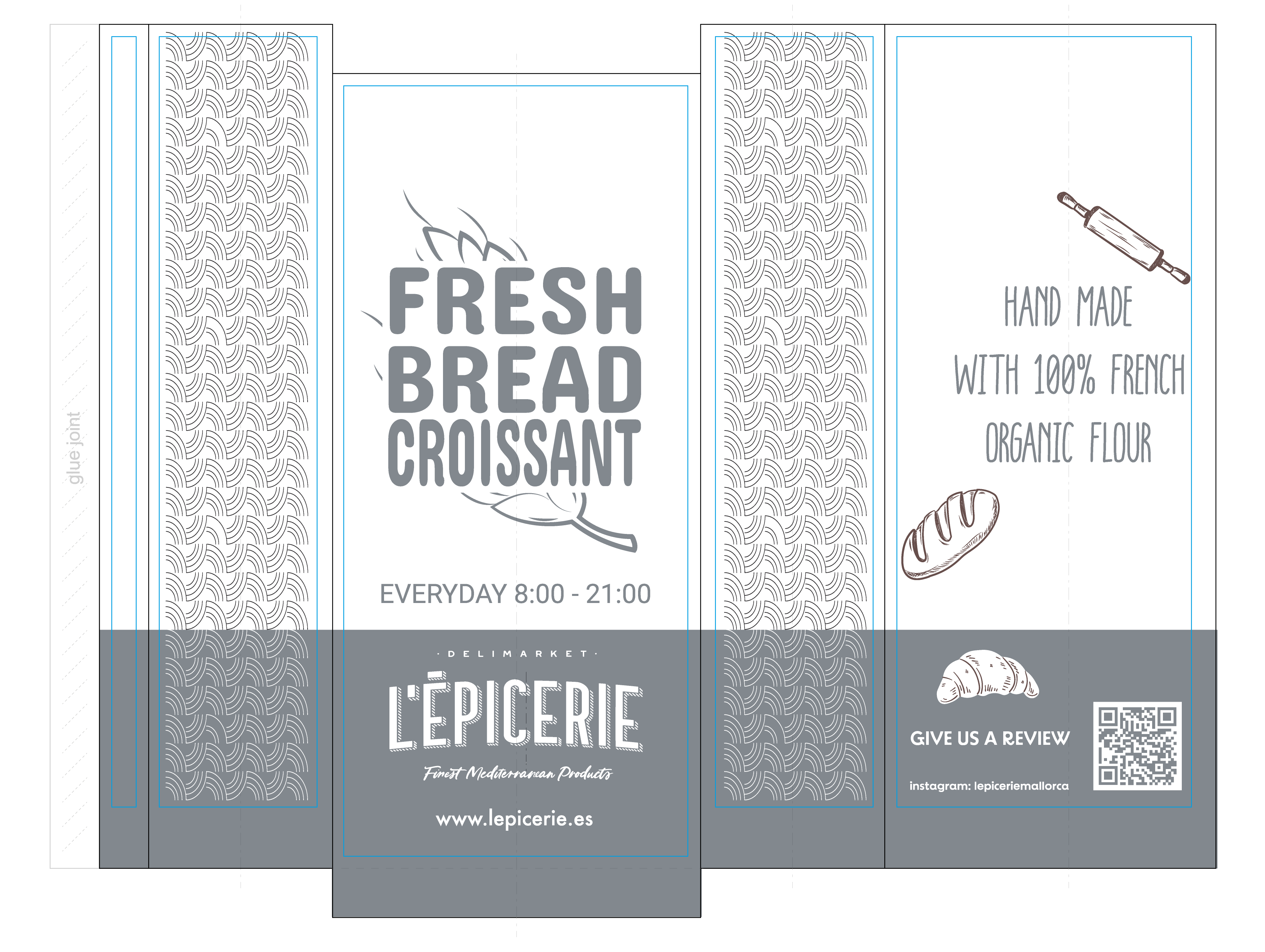
This design for L’Épicerie contains many elements that make it visually appealing, but at the same time it is straightforward and easy to understand.
There is no complex information to digest as the elements in the design clearly convey the brand’s identity and the products offered. For example, the motifs of croissants and bread are a great way of creating a connection between the brand and freshly baked goods.
Plus, the inclusion of L’Épicerie’s website, Instagram, and opening hours gives potential customers all the information they need to find them.
Moreover, the different design on each side of the bag makes the brand more memorable, as customers will remember the design because of its variety.
And in this case, L’Épicerie has taken advantage of both sides to print designs with relevant information. Ultimately, the various design elements used help to establish the brand’s identity in a clear and effective way.
artic Bakehouse
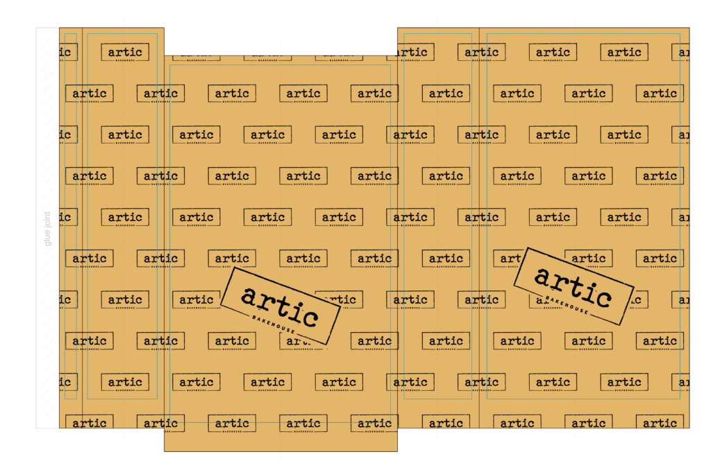
artic Bakehouse is a Prague-based bakery that specializes in sourdough breads and pastries. Their bread bag design is clean and minimalistic with a repetition of their logo across the entire bag and a large logo in the center on both sides.
This repeating pattern is a design element that helps to create brand recognition in an effective way and makes sure that the brand is unmistakable. In addition, the kraft brown background color fits perfectly with the bakery’s aesthetic.
The Poke Zone
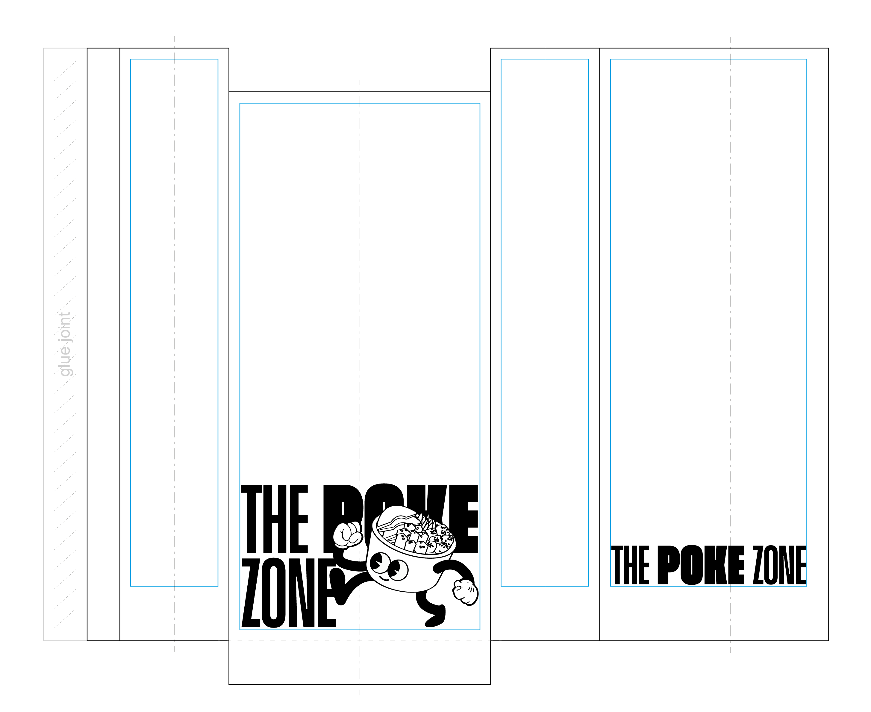
This design for The Poke Zone contains one special element that really makes it stand out: a poke bowl with eyes, arms and legs in motion, passing by the brand’s logo.
This dynamic element adds a sense of liveliness to the design, while also giving the brand a playful image that may appeal to customers.
The sharp contrast between the white background color and the black printing highlights the living poke bowl even more, and the use of the two colors creates an overall clean and aesthetic appeal.
RC-KleinKram
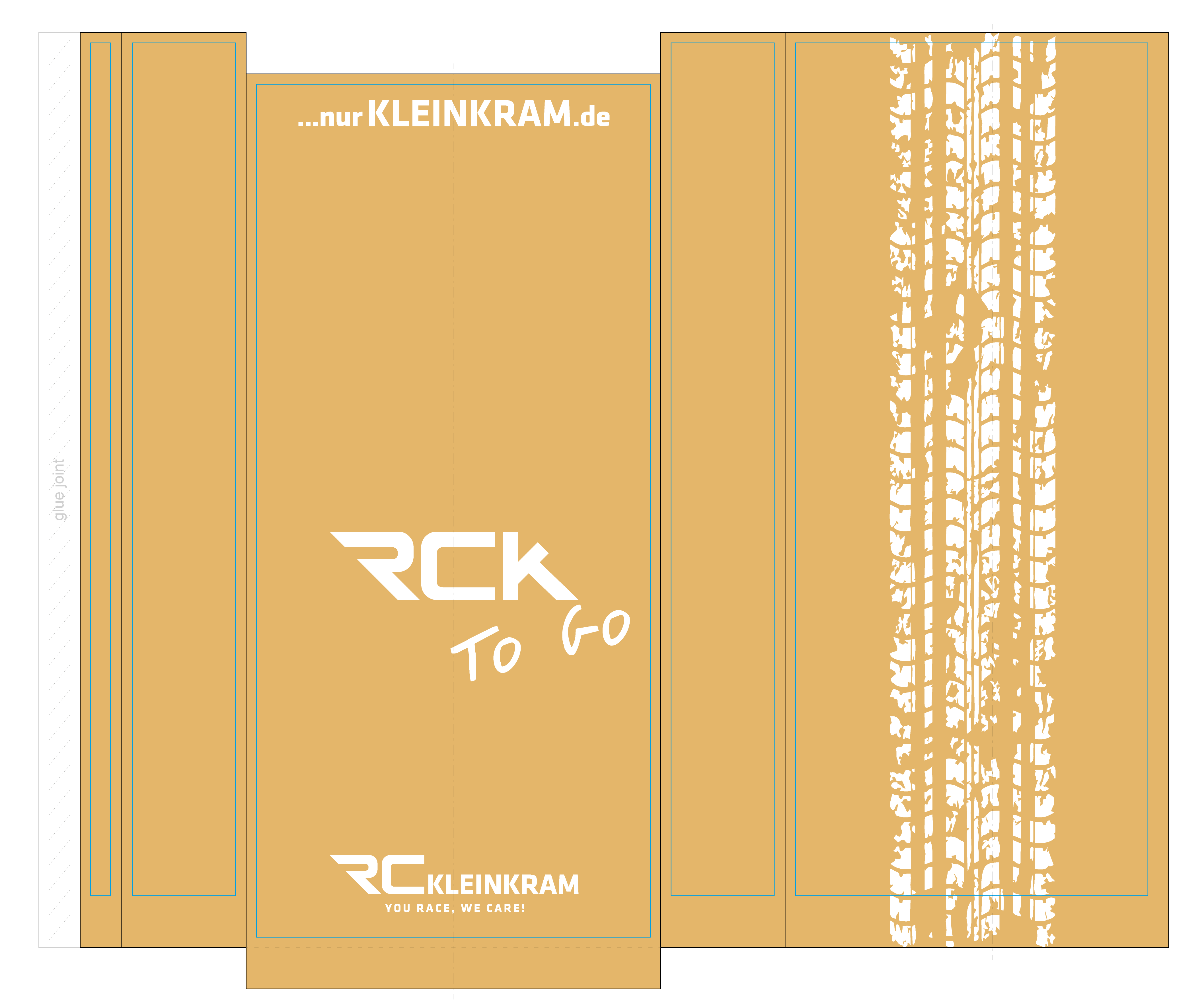
RC-KleinKram is a webshop that specializes in and sells electric vehicles and related products such as tuning parts, batteries and other accessories. On the front of the bag, their logo, website and slogan are displayed.
Their slogan “You race, we care!” says everything customers need to know about their dedication to great service. But what really completes the design is the inclusion of a wheel track on the back of the bag, which represents their brand essence.
Plus, the white printing on the kraft brown background really makes the wheel track, including the other design elements, grab attention.
Doughnut Time London
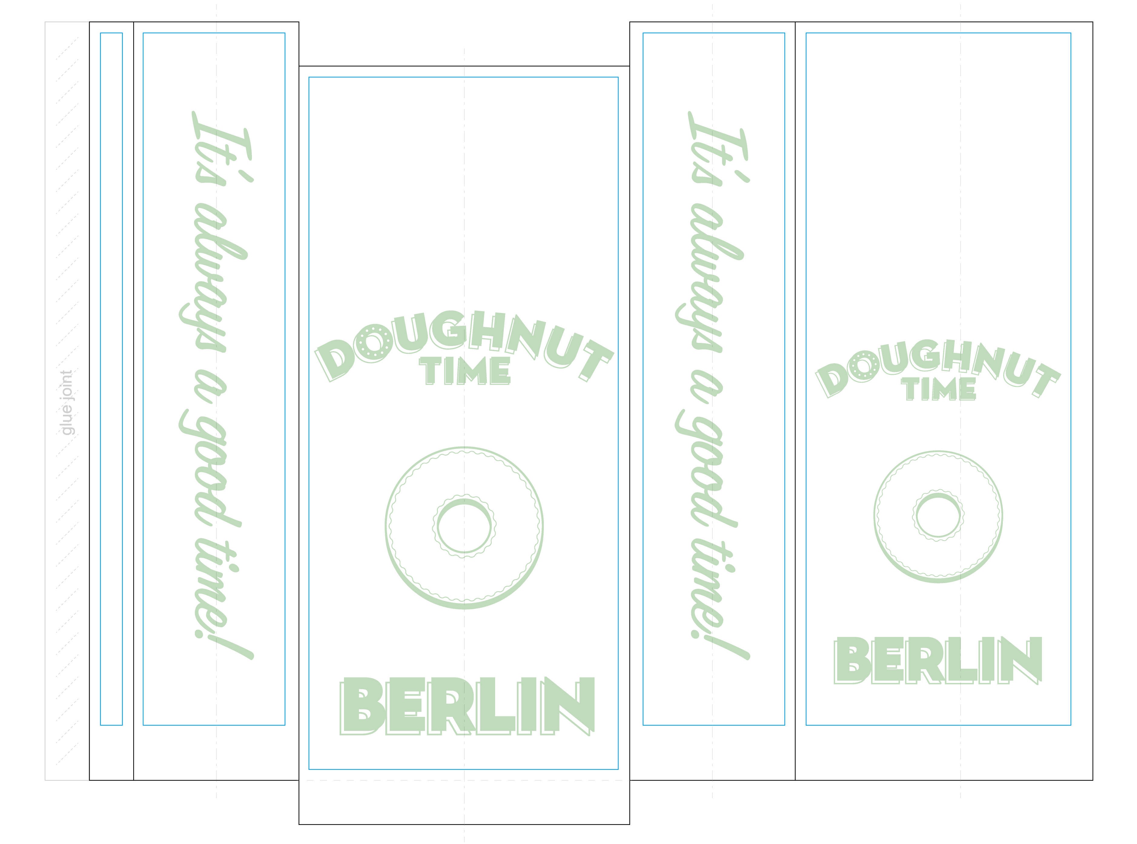
In this design for Doughnut Time, the logo is placed in the center on both sides of the bag, and takes up most of the surface.
Both the placement and size ensure that the logo is clearly visible and easily recognizable, and the simplicity of having only the logo increases the brand’s visibility even more. Furthermore, the donut in the design leaves no doubt as to what treats are on offer.
Their slogan “It’s always a good time!” adds a personal touch to the design and appeals to customers by promising them a good experience when buying their product. Moreover, the green pastel colors on the white background create a warm and relaxing feel.